Canna42 wordmark in yellow on black

Overview

Canna42 needed to position marketing as something people participate in, rather than something pushed at them. The identity combines classic cinema, Old Vegas, punk, and 90s hip-hop to create a sense of shared experience and cultural energy. Film grain, archival imagery, and expressive typography make the brand feel social, memorable, and alive.
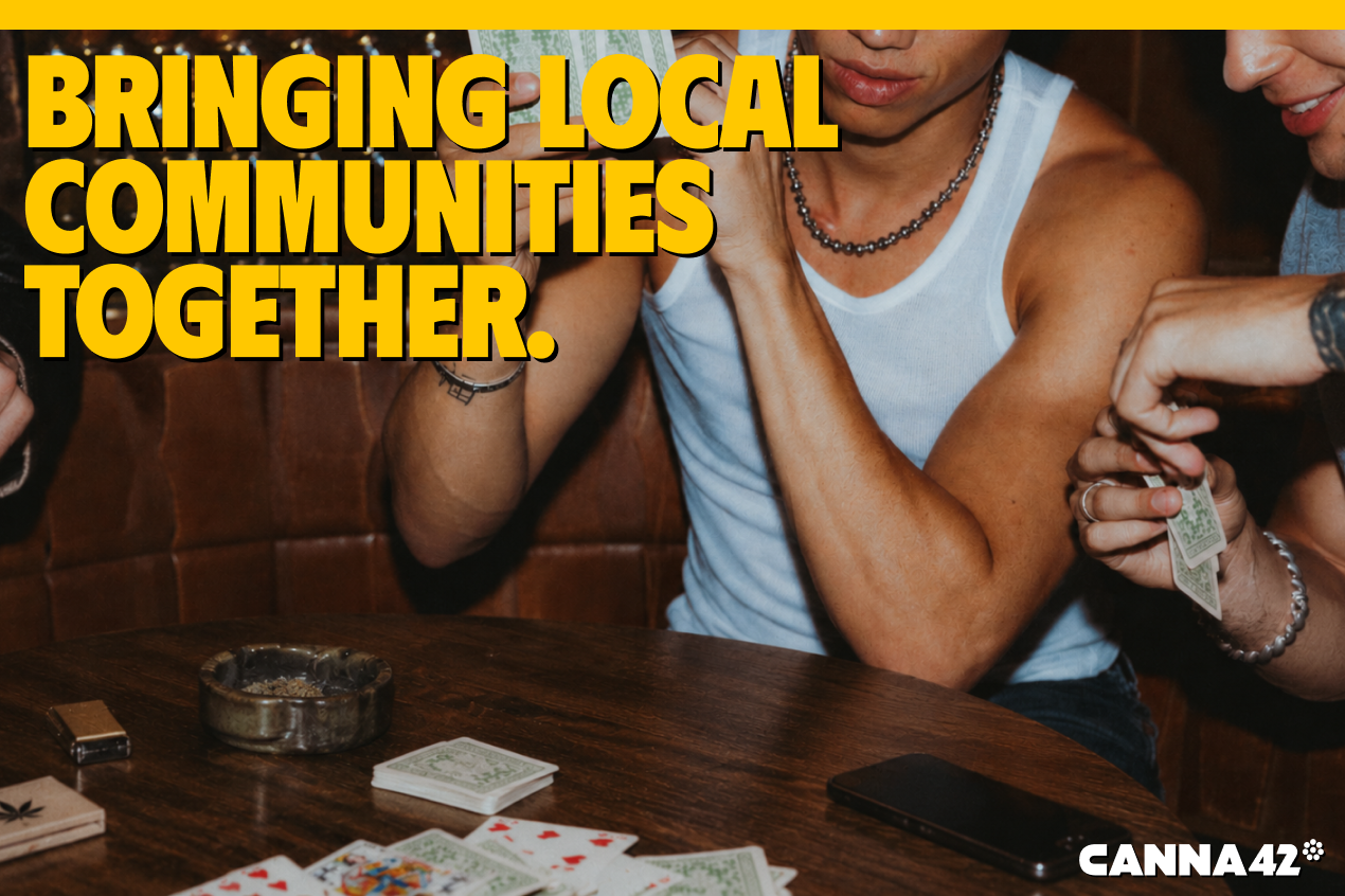
Friends playing cards with the headline "Bringing local communities together."
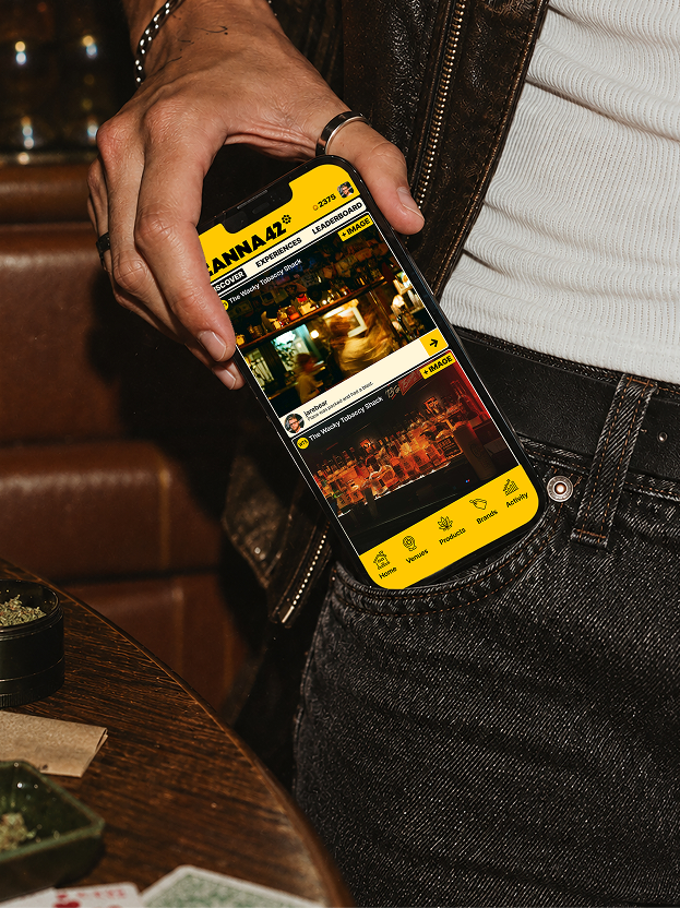
Hand pulling a phone running the Canna42 app from a jeans pocket
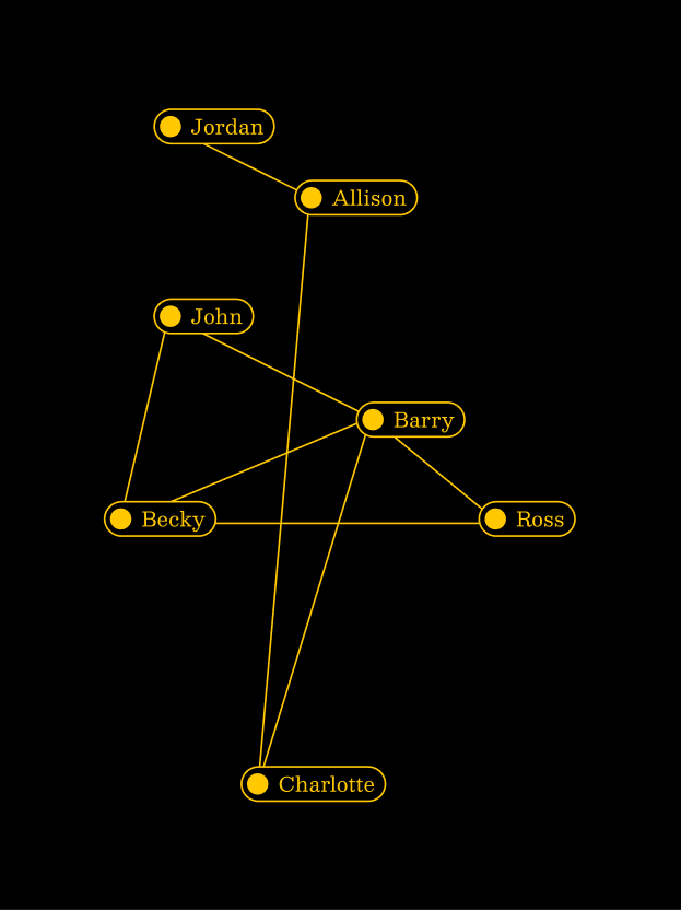
Yellow network diagram connecting community members by name
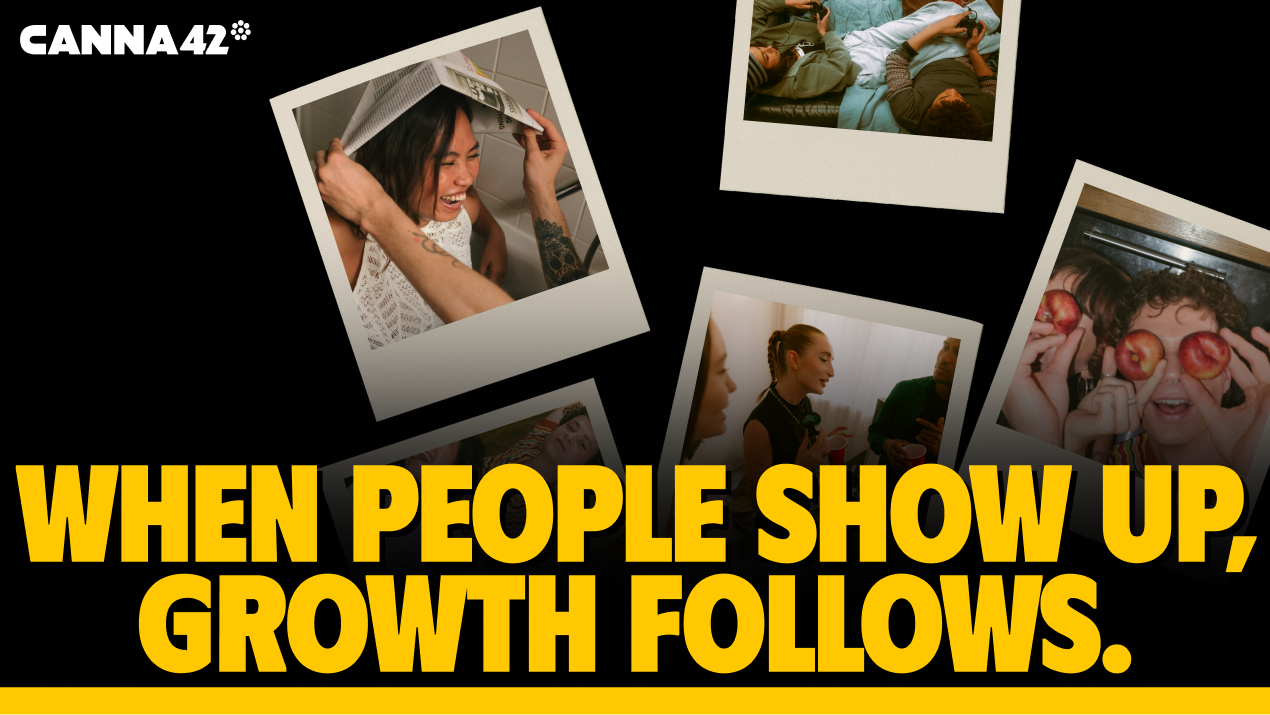
Scattered polaroids with the headline "When people show up, growth follows."
Canna42 wordmark shown at increasing sizes
Four dot-pattern brand marks
Overhead shot of two friends gaming on a couch with Canna42 branding
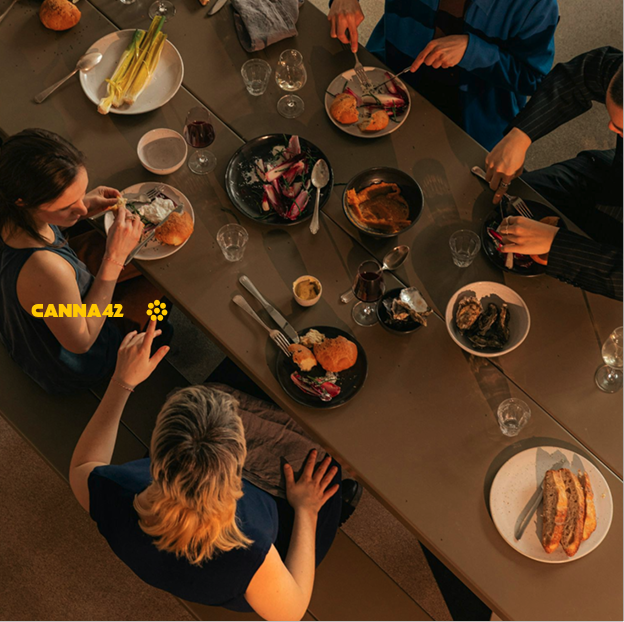
Overhead view of a shared dinner table with the Canna42 logo
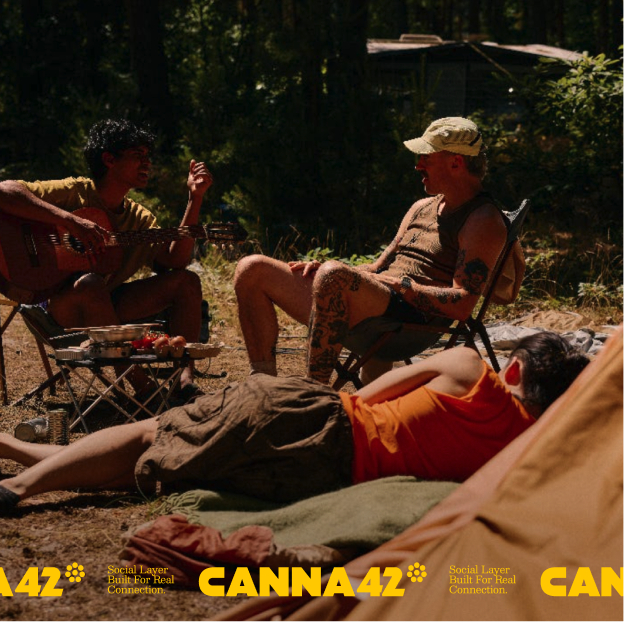
Friends at a campsite with a Canna42 brand band
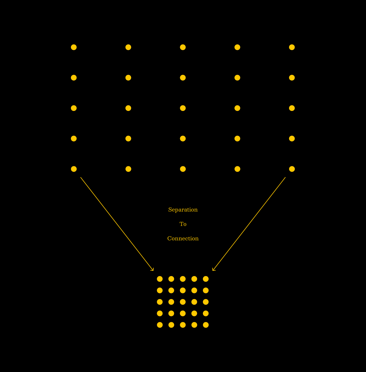
Dot grid diagram illustrating separation to connection
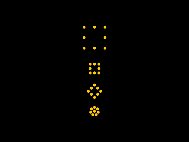
Dot mark evolving from a sparse square into the Canna42 flower
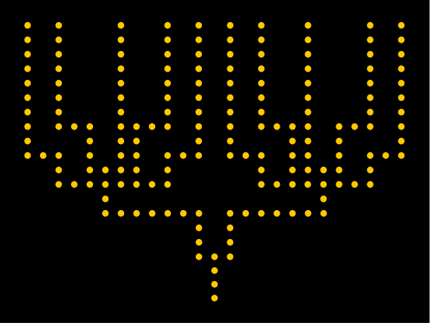
Branching dot pattern converging into a single stem
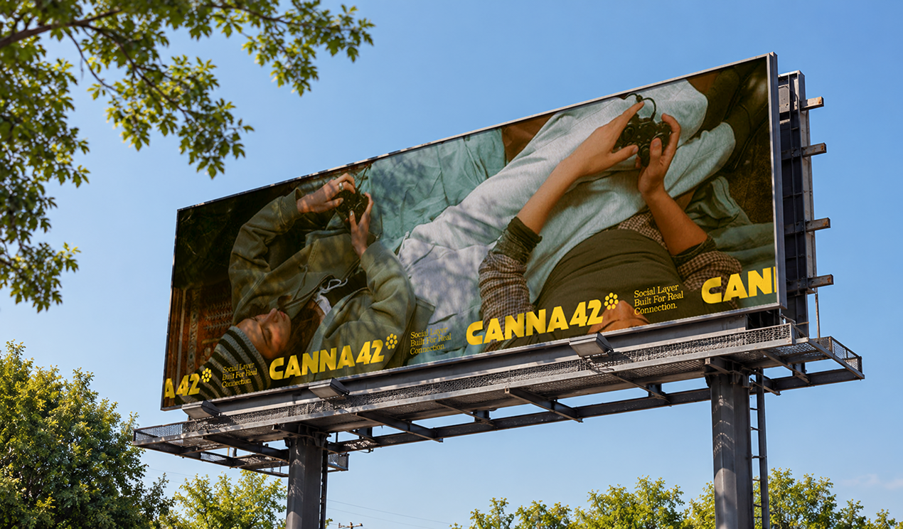
Canna42 billboard mockup against a blue sky